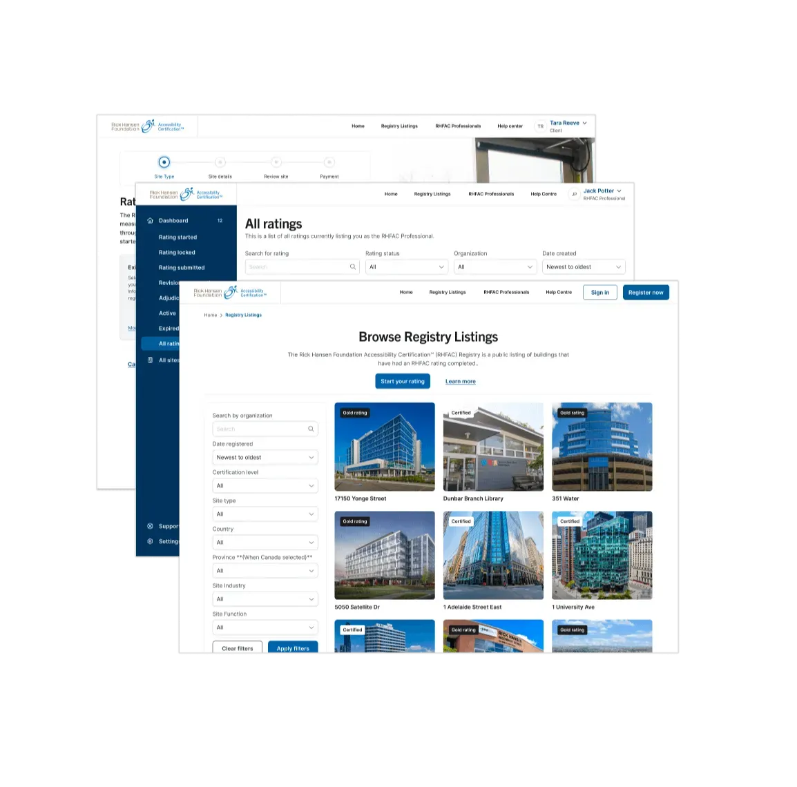
Improving physical accessibility through better online experiences
Project summary
Situation
The Rick Hansen Foundation’s Accessibility Certification is a national rating system that assesses and certifies building and site accessibility. By helping organizations identify barriers and improve accessibility, the Registry positively impacts the nearly 50% of adults in Canada who have experienced a permanent or temporary physical disability or live with someone who has. The Registry’s online platform was difficult for stakeholders to use. Time-consuming, manual processes slowed progress. The application was held back by outdated technology which limited the ability to modernize, and the registry itself was disconnected from the foundation’s CRM.Solution
We set out to enhance digital accessibility, grounding new designs on simplicity and user experience. We addressed pain points preventing users from effectively interacting with the platform across their user journey. Through a modern, flexible and scalable tech stack, we ensured the platform could grow and evolve with user needs. To support ongoing enhancements and improvements, we developed intricate modules using frameworks that facilitate seamless code modifications. Overall, we created an enhanced and accessible user experience, through a future-proof modernization of the platform. Outcome and ImpactThe modernization of the RHFAC platform has greatly improved user experience and operational efficiency, making it more intuitive for stakeholders. By streamlining tasks, the platform accelerates the certification process, enabling organizations to quickly identify and address accessibility barriers. The modern tech stack and CRM integration enhance adaptability and collaboration, empowering organizations to create more accessible environments and positively impacting the quality of life for nearly 50% of Canadians with disabilities.
Organically, EYDS has become our trusted go-to partner for all our tech needs.
Orsa Papaioannou
Sr. Manager, Special Projects & Training, Rick Hansen Foundation
Liked by the client, loved by the usersThe client has received stellar feedback from diverse user groups about the new registry since its launch.
A full house, serving:
- 600+ organizations
- 2,000+ sites/ratings
- 1,200+ users
Design-led innovationThe new design system embodies simplicity, streamlines processes and helps in enhancing intuitiveness at every stage of the rating process.
New look, new technologyWe built the new Rick Hansen Accessibility Registry from scratch using the latest tech stack to address client needs.
“We all agree that this is, so far, the easiest accessibility testing.”
Laetitia Mfamobani
Accessibility Specialist, Marketing & Communications, Rick Hansen Foundation


